Although a bit overdue, I thought I’d share my 10 favourite images that I shot in 2012 and explain what I like about them. At the least I can use it as a yardstick for 2013 and aim to improve. The images are in no particular order as ranking them from 1 through 10 would be too daunting a task as my preference for one over another seems to change on a daily basis. Part of my basis for selection was also their popularity on my Facebook page and on 500px where they cumulatively amassed nearly 3500 likes.
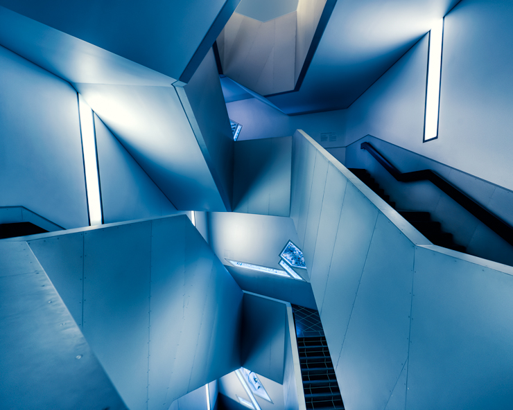
1. High Voltage
I shot this one at the Royal Ontario Museum in Toronto after getting my new 14-24mm lens and taking it out for a test drive. I didn’t expect much from the photo as the walls were dirty and the light created some really ugly color casts. Also, the design of the staircase, while incredibly cool and interesting, presented a lot of compositional challenges. I spent over an hour in the staircase and shot over 100 frames and just 2 were used as final images, this being one of them. What I like about the image is the Escher esque feel it gives you with lines running in all different directions and creating something that starts off feeling abstract and later becomes more clear. I chose to go with a blue color cast because the cool tones seemed to suit the futuristic feel of the structure best.
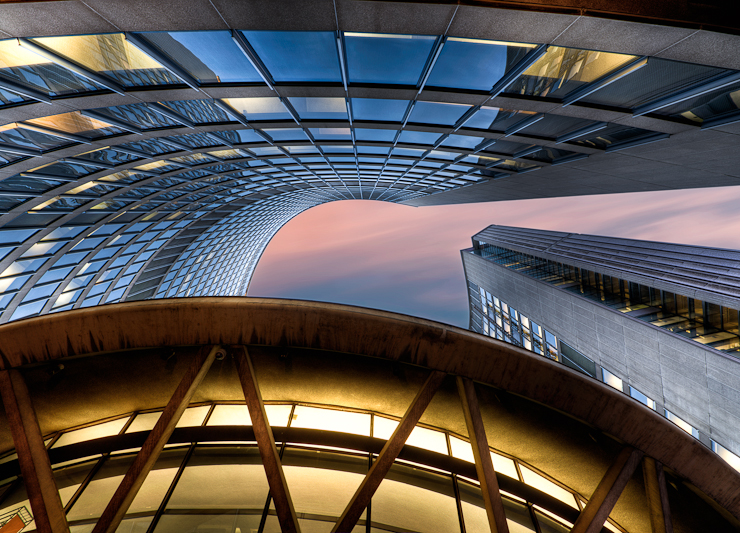
2. The Twist
Taken at Toronto’s City Hall, my goal was to capture the modern and forward thinking architecture of the building despite it being over 40 years old. The building is one of the landmarks of Toronto and has been shot to death so I looked for some angles and compositions that would bring a fresh perspective to it. The colorful HDR processing served to further play up the modern feel and resulted in what is now one of my favourite architectural images. The corkscrew effect created by the verticals in the windows seem to draw me into the image every time.
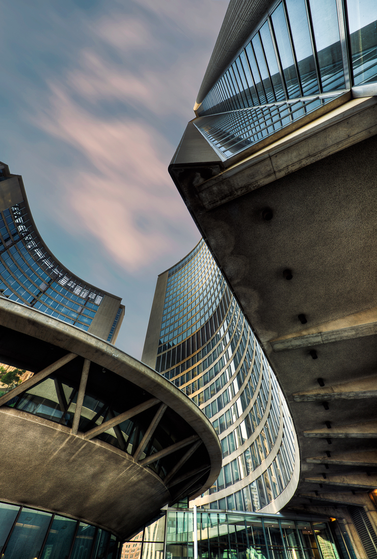
3. Spiral Hall
This was taken at a yet another visit to Toronto’s City Hall, this time with the goal of emphasizing the buildings height. Wandering around with the viewfinder glued to my eye, I stumbled across this rather unique and multi-dimensional view of the structure. I shot this from a nice low angle and the rest was down to processing to give it the modern feel I wanted. I really like the mixture of sweeping curves and leading lines created by the building and the way it shows the building as being both old and modern at the same time.
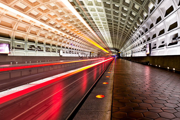
4. Subway Light
On my first visit to the DC Metro, I ended up leaving my camera at home and immediately regretted it. The system was awash in unique architecture, repeating patterns, vanishing points and interesting lights. Upon returning to the hotel, I immediately grabbed my camera and tripod and made a dash back to the nearest subway station. After about an hour of shooting various angles, locations and composition I was (not so politely) kicked out but not before capture this lucky image. Having seen the potential for it I set my camera on a tripod right near the edge of the tracks and awaited the trains arrival. Lucky for me, I timed the shutter release well and the image looked good after the first try. What I like about the resulting image is the way that the light trails seem to be encased by the ceiling and the sense of proximity to the train that I feel each time I look at it.
5. The Walt Disney Concert Hall
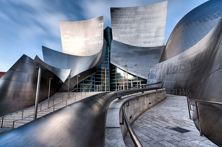
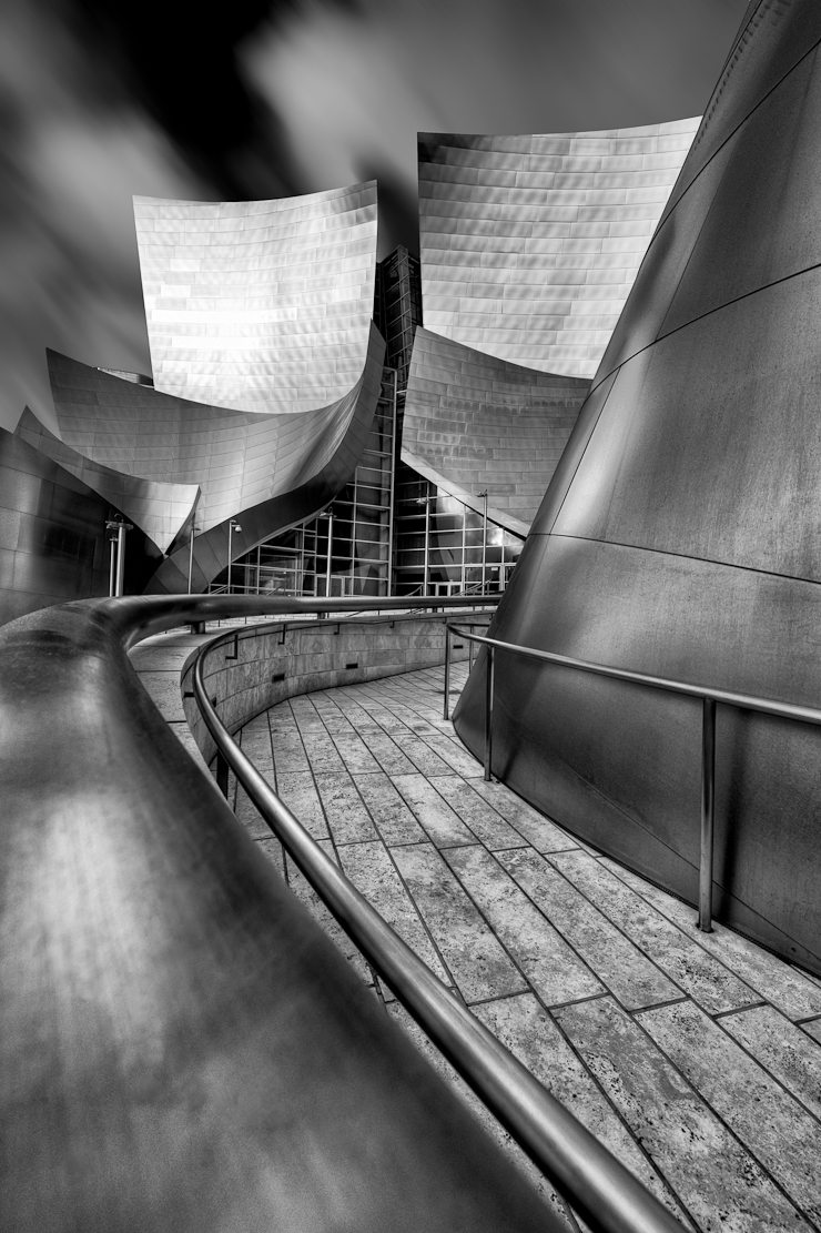
I find it too difficult to choose between the vertical B&W and and horizontal color versions of the image so I’ll include both. I was lucky enough to have the B&W version included in the Feb 2013 issue of Digital SLR Photography magazine so it most certainly had to be included here. Of all the things to photograph in Los Angeles, the Concert Hall was at the top of my list. After about an hour of shooting what felt like fairly typical images of the building, I took my camera off the tripod and found the railing that served as the kicking off point for the entire image. I like the way the railing draws me into the building and the way the metallic texture of the building comes across in both the color and B&W versions.
6. The Labyrinth
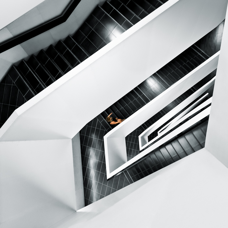
Also shot at the Royal Ontario Museum in Toronto, this image is has long been a favourite of mine due to it’s fairly simple color palette and minimalist feel. The mixture of black and white, disrupted by the single person walking make for what I think is a cool and unique image.
7. Stairway to Heaven
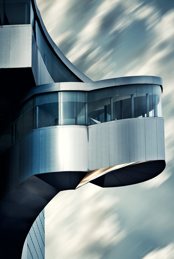
Shot on the exterior of the Art Gallery of Ontario, I like this image simply because of the uniqueness of the structure and the way it is set against the blurred sky. The blue and metallic tones help to play up the modern nature of the building and I feel represent the vision of it’s architect -Frank Gehry – quite nicely.
8. Beverly Hills Style
The light tones of the room and simple yet beautiful couch at the Mr C hotel in Beverly Hills immediately drew me in as a great spot for a portrait. The details of the shoot can be found in this post so I won’t elaborate on them here. What I love about the image is ethereal feeling within it and the color contrast between the models skin tone, dress and surroundings. The off to the side gaze adds a further sense of mystery and keeps me lingering in the frame for longer than a straight on shot would.
9. Lindsey
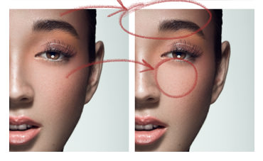
Shot as part of a beauty shoot, I simply like the mix of the vibrant make-up and accessories with the muted tones of the background and skin. The model’s great features and somewhat mysterious expression also go a long way towards making this image a favourite of mine.
10. Brianna
Also part of a beauty shoot, the image finds it’s way into my top 10 for a couple of reasons. The combination of highlight, shadow and highlight as you move from right to left creates a more interesting and unique – albeit less organic – image than a single light would. The model’s large eyes stand out nicely and the earthy tones of the her skin, hair and make-up form a cohesiveness within the shot. The tight crop also draws me into the model’s features and removes any distractions.
I hope you enjoyed that round-up of images for 2012, and with any luck I can bring you an even better set for 2013.

